What?! Not theremin antennas for PU1 and PU2?! ![]()
What?! Not theremin antennas for PU1 and PU2?!
someone get on this.
right now.
ashimoke wrote:What?! Not theremin antennas for PU1 and PU2?!
someone get on this.
right now.
i was just thinking this a thermin mod for a gameboy? siiiiiick
Easy way to do this: LTC variable clock speed with LDR.
I'm pretty sure that should be possible with a modified arduinoboy code and a little extra hardware.
Also what asimoke says, of course. Much easier xD
Last edited by DogTag (Apr 28, 2013 9:34 am)
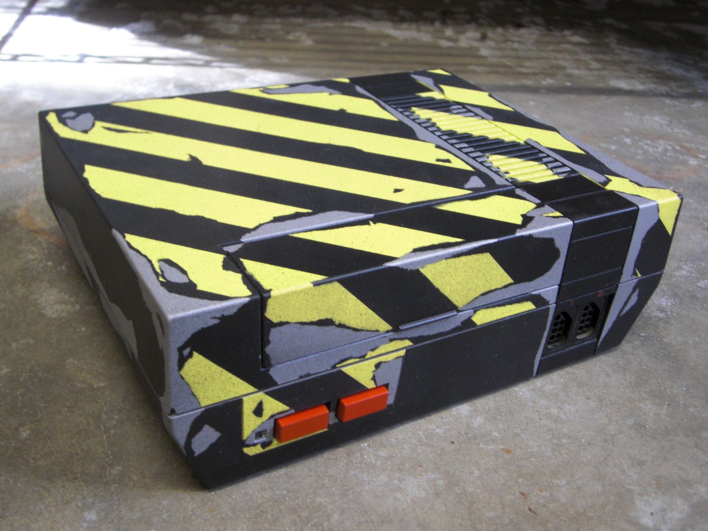
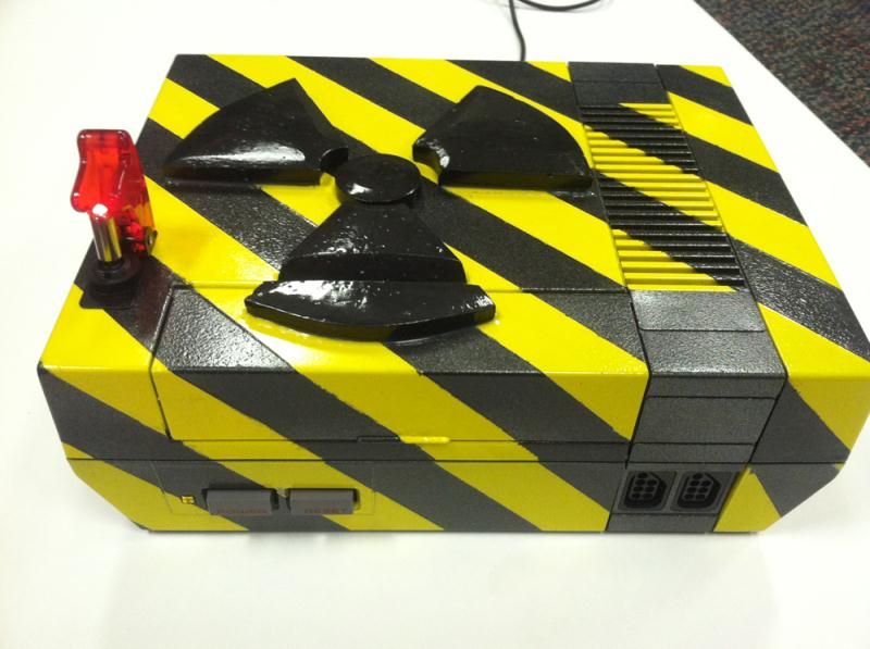
Don't sweat it mate. Yours is much better than theres. Hands down! That switch on top is probably useless and the biohazard logo looks terrible.
I wouldn't say ripped off, it's probably an idea that other people have had, you tend to come up with pretty good ideas anyway (see you're other project) which funnily enough happens to be something I thought about before you made your thread. Anyway, their paintjob looks tacky as fuck yo, the entire thing looks nasty and shiny, and the biohazard logo and the light look really shite and cheap.
I wouldnt call ripping off something as generic as yellow-black, plus, like others said, their paintjob looks like shit.
I meant for "Ripped Off" to be more tongue in cheek.
The coincidental similarities were amusing, and that other console emerged just after mine did.
Sorry if you guys were taking it seriously, I just thought it was funny as hell.
That switch on top is probably useless and the biohazard logo looks terrible.
Anyway, their paintjob looks tacky as fuck yo, the entire thing looks nasty and shiny, and the biohazard logo and the light look really shite and cheap.
That symbol (not a logo) represents a radiation hazard. I recently had a conversation, spawned while searching for a vinyl radiation decal (I don't want to paint, in case I change my mind), regarding people not understanding what these warning symbols represent (such as seen in Star Trek: The Next Generation episode "Thine Own Self"). I suppose as long as people know it means "bad for you" it is helpful. At least testing was done to design another radiation symbol, so that people know to run away away from the bad stuff that floats overhead and can kill and squirt water at you, or something about pirates.
I also prefer Teh D3th St4r's design, as I usually look for stuff that is slightly beat up and old (such as the radium alarm clock I sleep next to). I don't really like the stripes in general, but the way he did it emulates the worn look I like, that the other lacks. Kinda reminds me of the Mother 3 Game Boy Micro. I really wish I had the skill to get that worn look, either with paint or vinyl, for the project I mentioned earlier. I was amused by the "before and after" idea.
That symbol (not a logo) represents a radiation hazard. I recently had a conversation, spawned while searching for a vinyl radiation decal (I don't want to paint, in case I change my mind), regarding people not understanding what these warning symbols represent (such as seen in Star Trek: The Next Generation episode "Thine Own Self"). I suppose as long as people know it means "bad for you" it is helpful. At least testing was done to design another radiation symbol, so that people know to run away away from the bad stuff that floats overhead and can kill and squirt water at you, or something about pirates.
Biohazard logo... Radiation symbol... Nobody cares about what it really is. It was not put there to warn anybody about radiation therefore, I also will call it a logo.
Nobody cares about what it really is.
If you say so.
I was looking to get a DMG and start playing some classics again. I also wanted to look into what kind of mods were available for the DMGs and was blown away when I found this forum. After a handful of orders from ASM and Kitsch here is what I wound up with...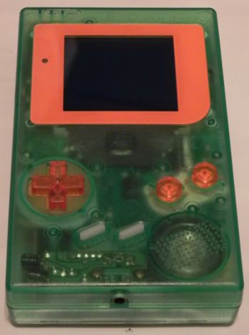
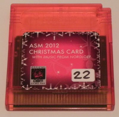
Mods...
Clear Green Kitsch Case
ASM VC 4 LED Green Backlight
ASM Orange Modern Screen Cover
Kitsch Clear Silicone Start Select Buttons
Kitsch Clear Orange DMG Button Set
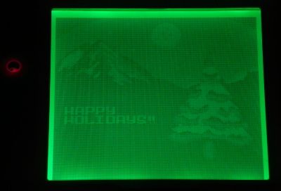
And I simply could not resist the ASM Christmas Card
I would like to thank the forum for the inspiration and Kitsch and ASM for the great products that helped me build a nice gaming DMG. I'm finding it hard to stop at one and am already hoarding parts for another DMG build.
welcome, and thanks so much for posting its really great seeing what people come up with! and congrats on the great looking/clean mod, i'm not alone in saying nice job on backlighting the LCD on the first attempt without screwing it up!
yeah, for a first mod, that's really clean!
and that christmas card/cart looks fun, i wish i would've picked one up.
