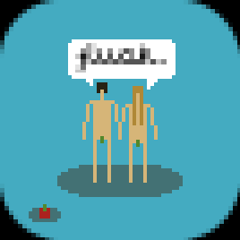
@EmThree: Well, this: "going for a super minimal style, a la superbrothers". I really think you got enough talent to go your own way.. Maybe it sounds a bit harsh but i really felt someone needed to say it.
(as we once did an interview with him: http://www.8bittoday.com/articles/21/superbrothers - therefore i have strong feelings about it.)
I really think you got enough talent to go your own way..
I feel this way too. I really like your previous stuff and i think you can rock on with your own style!
@EmThree: Well, this: "going for a super minimal style, a la superbrothers". I really think you got enough talent to go your own way.. Maybe it sounds a bit harsh but i really felt someone needed to say it.
(as we once did an interview with him: http://www.8bittoday.com/articles/21/superbrothers - therefore i have strong feelings about it.)
If you have a look at your interview with him (which by the way is great), you can really see he's going in a different direction from me...his colors are a lot more muted and the shapes he uses are less angular, more "organic" even. I don't know, sure I am doing one pixel thin heads but that's where the similarities end...I've only seen some of his work, but I have read that article before. Pallate wise and even style wise, his work is really different. I'm not seeking to imitate him, I am just inspired. Every impressionist artist is not copying off of Monet, rather just expanding on something he pioneered and I think I am doing something similar here. I appreciate your criticism but I think dabbling in some unfamiliar waters is a great idea....I usually work with like a 128 x 128 canvas or something and now I'm doing 67 x 67. It's definitely challenging and, I think, a great way to become more "talented". I'm aiming for a super minimalist approach, not only inspired by superbrothers but Cactus's "shotgun ninja", the original Legend of Zelda and a bunch of other "art" and the challenge here is to go with it "my own way".
You've got some of my stuff here:
and then superbrothers
There are some stylistic similarities, just like you'd find with impressionist artists, but they are both very different takes on the style.
Keff: My old style is just that...it's old, I want to try something out of my comfort zone. I hope you understand this haha. I really enjoy making artwork in the sorts of styles I've dabbled in before (especially this one: http://8bc.org/items/images/mm2finishedy.PNG) but it's incredibly time consuming. With school and everything, I'd still love to get some more art done but I don't have as much free time as I used to, so I've created this blog to just upload pixel "sketches"...these aren't nearly as serious as work I've previously done in that not a whole lot of effort is being put in to them; they are just being created for my enjoyment. I'd like to get back to detailed pixel art but I just don't have the time right now, so working with a "simpler" creative outlet is (I think) the only option for me aside from not making art at all.
Hopefully I didn't sound harsh at all here, I really appreciate the concern!
Last edited by EmThree (Dec 8, 2010 8:06 am)
I thought the shoulder and heads and legs were really similar on your pics and superbrothers, but that is also because of the size and things.
I still love your work, keep on pixeling!
g0g0!
but that is also because of the size and things.
lololololololololololol, his adam and eve picture.
I thought you were referring to the size of the leaves too
Meh @ superbrothers fandom. Very bad more to rip off someone who both has a very unique style and is also super famous.
I really like the rest.
I like it. I agree at such low resolution it's hard to differentiate styles but you've done a good job

