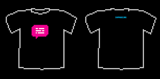
LOW-REZ mode is sexy
DKSTR, the magenta shirt thing was kind of sarcastic
Well yeah I figured that:)
pixls wrote:this isn't what i was thinking of as my amazing design but it was an idea i had,
also i was thinking maybe putting "CHIPMUSIC.ORG" in one of these fancy speech bubbles we have now?I think it should be the chip bubble. A text bubble doesn't really represent the site as much as the chip bubble would.
What SeanBad said.
SeanBad wrote:I think it should be the chip bubble. A text bubble doesn't really represent the site as much as the chip bubble would.
What SeanBad said.
like this?
(more opinions!)
oh also, didn't realize it but this has the "CHIPMUSIC.ORG" in the kind of speech bubble that posts are put in, keep y/n?
or like this ![]()
Last edited by pixls (Jan 28, 2010 12:30 am)
Well I'd prefer black but why not have the option to get both colors?
i'd buy one for sure, would be nice to have the text on the front too, better fo' reppin' yo!
Well I'd prefer black but why not have the option to get both colors?
i'd like that, but the only thing is then you'd have order each and it would be hard to figure out how many of each to get, because they probably wouldn't sell equally
also, thoughts on the little bubble on the back everyone?
I'm not feeling the bubble or the pink shirt too much
I'm not feeling the bubble or the pink shirt too much
me neither but i thought i'd put it out there
5 pages of what?
of awesome ![]()


