After many moons i've been able to amass enough material to compile into a full-length album release!  I've spent a ton of effort getting everything right - please listen to it and let me know what you think.

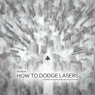
bryface - HOW TO DODGE LASERS
An album made entirely with the KORG DS-10
Download: HTTP://WWW.WAVEFORMTOWN.COM/HOWTODODGELASERS (114MB)

EDIT 02/25/2011: i finally got around to putting it on bandcamp: http://bryface.bandcamp.com/album/how-to-dodge-lasers

here's the tracklist:

1. warmth of the sun
2. thought process
3. evolving
4. subterranean
5. ice colony
6. her head is in the clouds
7. at the speed of neurons
8. hope and despair
9. fight town
10. a new girl appears!
11. the final boss is tom selleck
12. a matter of honour
13. the future is bright
14. second reality (future crew cover) (bonus track lol lol)

any questions, feel free to ask!
802

(17 replies, posted in Bugs and Requests)

so... i don't know if anyone else is experiencing this, but a lot of the "bold" fonts on here are really hard on my eyes.  a lot of them have Helvetica at weird settings that give them these super-thick blurry anti-aliased outlines that my eyes have a really hard time picking out.  I'm on a windows machine btw, with most of the standard helvetica fonts installed. 

the fonts look a little better and skinnier on my ubuntu machine where i have my helvetica fonts installed as well, but they're still on the blurry and unhinted side.

i used firebug to temporarily change the fonts to something more standard and the difference is freaking night and day.

don't get me wrong, i dig the site's look and feel and i appreciate the effort to make the fonts distinctive.  but is there any possibility of tweaking the CSS a little bit to make it a little more comfortable for windows users?

here's what it looks like on my machine btw: