Pages NOT taking up the entire browser space is poor coding though, according to W3C, who currently maintains modern web standards. The reason people code pages to not fill the page is because they learned to do layout with fixed tables and a fixed 640x480 resolution, THAT is very 1993. And in 1993 people used Frontpage express and such, again with fixed tables, style attributes directly on the page and suich.

People may not look at the code, but search engines will. And if you cram a bunch of Javascript and Flash and such to make it "look nice", you will garble the code.

The fixed with can't be changed without breaking compliance with several "Best practices", such as WCAG and WAI, and I care about that stuff. But like I've said I'll get to fixing the headers thing. That was a mistake on my part.
Like I said I'm currently evaluating two ad companies. Dating and gambling is not something that is relevant content, no. Which is why I will probably opt for the other one.

Regarding the header, It was a valuable peace of information. Exactly the type of criticism I came here for. I will change it to Header tags instead. It's probably better to do that from a SEO point of view anyway. Thank you.

Thank you for the constructive criticism finally. I must correct you on one thing though. The code is far from old and outdated. It validated against XHTML1.1 and CSS2, the most recent Actual W3C standards. Sure, HTML5 and CSS3 are on the way and such, but they are not done. And as a webdesigner I take pride in using proper code. I'm well aware that I could probably slab something together in Drupal in 5 minutes that is going to look more "modern" or whatever, but that would throw my SEO-work away and would probably make google webmaster tools puke all over the place.
Regarding adblock on Firefox I already stated that there are probably alternatives for other browsers as well. If you are too lazy to download the proper addon for your browser of choice, that is not my fault.

Regarding the content area: would it help if I had some sort of index at the top, like I have on my album pages? That would guide people to the content they are interested in a bit quicker.

And that is why we use Firefox with Adblock. If you feel that you do not want to view ads, don't. It's as simple as that. For others it makes sense to not want to cough up the entire cost of web hosting on your own. Ads and donations are a help in paying for domain names and hosting services and such. With ads on the site, it fills in the holes left when people don't donate to cover the entire cost of running the website.

Again, there is adblock for Firefox, and probably other addons for other browsers. I really wish that I'd get my website and hosting space for free, but I don't, not money-wise, nor time-wise. Therefore I have adds. No one is forcing you to visit the site, and if you visit the site, no one forces you to look at the ads, so drop your attitude please.

Thank you to those of you who have taken the time to give constructive criticism on the design. I will replace the background and menu so that they have a more modest color scheme. That is "In progress".

Regarding the flaming comments, learn to understand the meaning of _constructive_ criticism. If you think the design sucks, that is fine, but please tell me why instead of just stating that it sucks.

How is the font standing out in an ugly way? Is it the font itself of the white color, or both? I would like to have an 8-bit/arcadish font but unfortunately It's a safer bet to go with something widespread as not all browsers support installable fonts, and I place a lot of weight on accessibility and complying with the CSS2 and XHTML1.1 standards.

Regarding the ads there will pronbably be less of them in the future. I'm currently evaluating two different ad-companies to see which one presents more relevant adds to my visitors. If you have an idea for a change in placement I'll be happy to listen. The current placement is so that the adds will not "break off" any content, as seen on many other more "modern looking" websites. For example a lot of people place a gargantuan add unit directly underneath the menu. This clearly generates more revenue but I'm sure it annoys users to a greater degree. Again, thank you all for your input, keep it coming smile

Hello!

I have been trying to get some advice on how to get my website to be more NES/8-bit...ish. I've been asking in a general computer forum and most of the people there seem to think that the site has an "old looking and outdated design", but... That's kinda the point... I don't mean to ramble so just tell me what you think. What is good, what is bad, what can be improved, removed, added and so on. I value your help and I am looking forward to some experts on the subject reviews smile

The url is http://ozzed.net

23

(3 replies, posted in Releases)

Sorry about that. It should be corrected now.

24

(3 replies, posted in Releases)

Hello.

I go by the artist name of Ozzed. For those of you who do not know about me, I am an 8-bit and bitpop-artist who has been publicly making chip music since late 2008.

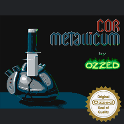
Today I want to tell you about my newest release "Cor Metallicum". It is a concept album featuring 12 tunes made in Famitracker, with an actual story line to it. You can download it from Ozzed.net where you can also find my other albums, and possibly site releases if you click around a bit (Site Releases are tunes that only exist on my website and not on Last.fm or Jamendo, or any of the other places that I live).

Here is the front cover art for the album (My brother made this, not me, and it's NES-compatible)

I hope you will enjoy it smile