quick player preview is awesome
I love the music, but having the latest posts taking up more than half the page just seems ugly to me... Any way to squash it slightly more? I'd say that the actual forum navigation itself is more important, and therefore should have at least equal, if not more, space
But otherwise, it looks great! Love having the music at the top, really cool. Music might actually get a few views on here now...
The changes to the music stuff on the front page helps alot with the cluttered complaint.. but still feel there should be some more seperation somehow..
the functionality is awesome though!
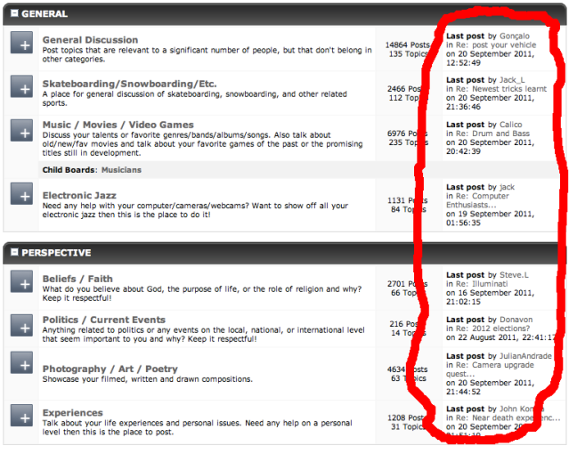
Also, I just realised that it now no longer tells you what the most recent post in any given forum is anymore. I used that a LOT, and it's a staple feature on every forum I've ever been on - I'd guess for a reason. It would be nice to have that again :c
Also, I just realised that it now no longer tells you what the most recent post in any given forum is anymore. I used that a LOT, and it's a staple feature on every forum I've ever been on - I'd guess for a reason. It would be nice to have that again :c
It's still there.
Possible bug: I had a new PM this morning and the notification bubble was coming out of the profile button. Clicking it too me directly to the message tho.
Yeah you're right since the recent posts tab is back. The notifier needs to be pushed over more.
TraceKaiser wrote:Also, I just realised that it now no longer tells you what the most recent post in any given forum is anymore. I used that a LOT, and it's a staple feature on every forum I've ever been on - I'd guess for a reason. It would be nice to have that again :c
It's still there.
Maybe I wasn't clear enough - on the home page, next to each forum section it would say what the last post in that forum was. It's on like, every forum ever. And is super useful. And now is gone.
I could take a screenshot of another forum if you don't get what I mean?
quick player preview is awesome
agreed, I like that very much
But you can already seem the most recent posts on the right?
I think the new width on recent music makes everything look much cleaner.
I'm talking about that kind of thing.
It's just a small thing really - but I do really dislike how the recent posts takes up more room than the actual forum index. Would it not be better to have just the recent posts listed in the empty space under the online list, with the index taking up the same room as it used to?
I really think it needs to be more prominent. It looks far too squashed/busy with the recent posts taking up that much central space.
Totally disagree. If you care that much about who it was who commented, surly you'd check the post regardless? And the "Latest Forum Activity" section just seems to make sense, especially as the art section (in my opinion and experience anyway), seemed to not get as much attention as the others simply because it was lower down. Though for OCD's sakes it'd be sweet if the "Latest Forum Activity" went down as far as the forum list on the left did ![]()
Oh yeah, like I said it's a small thing, but it's nice to be able to see if somebody has replied to the specific thread you have commented on, for example. I always found it really useful.
Not complaining about the recent activity part either. That point was just something small haha
My main point is still that the recent activity part is far too large. The index is given about as much room as the "Who's online" bar now.
Maybe if you lined them up with the music part? So the recent activity section started at the third bar of recent music (if that makes sense). Then it'll be even and all griddy and shit.
Last edited by TraceKaiser (Sep 20, 2011 10:14 pm)
I agree about the length of the page, but we'll worry about that later...
And I agree there should and will be a main "Forum Index" page which will be a tab at the top, which will basically be the old home page. Thats the next thing to do.
Oh no, I like having the recent activity thing! I just think it's too big ![]()
See my edit on my last post - reckon that would be possible?
Right, hehe. Things are ever changing it's hard to keep up. Now that the music section is percentage and fixed to 4 items per row, it makes sense to have the section below it be 50/50.
Where as a few hours ago and yesterday we had the music items fit to whatever the window width would allow, which made smaller resolutions look sloppy as herr_prof pointed me to.
What I was referring to in the post above is that I plan on having the home page content stay as it is now, but also adding a new tab called "forums" to the top that would link to "/forums" which would essentially be what the homepage was before this whole mess started. Hopefully making everyone happy. The only thing in the way of that is having to fix the breadcrumbs on our pages. Which takes a bit of time.
Sounds great ![]()
Nice for a website to actually take into account user feedback for once, rather than leaving major features broken for months....
