Offline
Louisiana

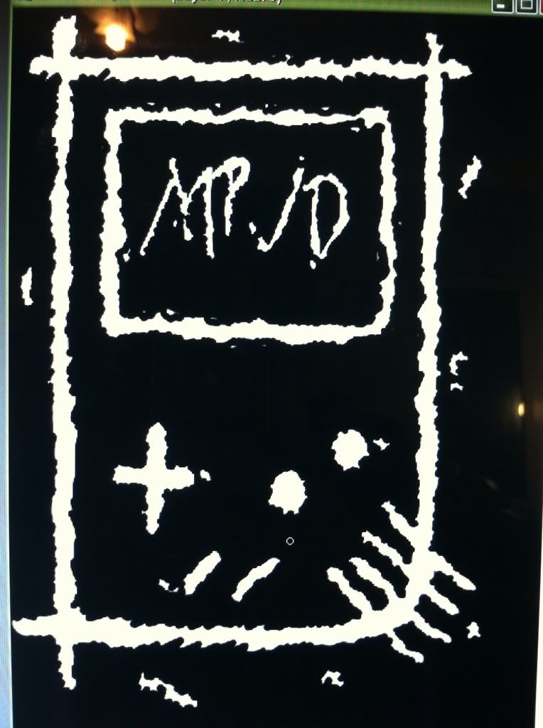
Just wanted to get some honest opinions on a shirt design. This is only one of 5-6 designs we are going to do. The one the community likes the most will be the one we actually print. As you see the image keep in mind, yes I know a lot of chip tuners have used the image of the gameboy on their shirts and its a bit over used. It's just a possible design, and I'm also keeping in mind that I want this thing to sell locally and there is literally NO chip scene down here at all but loads of gamers and they may just buy it because of the fact it has a gameboy on it. Cheap move I know but hey if it works right? Then we could afford to make more graphic and complex designs. With this design I wanted to go for kind of an old school broken punk rock meets gaming meets Johnny the Homicidal Maniac look. Well enough with the chit chat here's the design:

Honest opinions please. Good, bad, neutral? We want to hear it all. Once the other designs are ready I will post them all here and change the Topic to something's else and the voting will officially begin.

Offline

I don't dig it.
Even if i would be only a gamer guy and don't be interested in chiptune style music, the design is way to simple in a uninteresting way.
I wouldn't spend money on that.

Last edited by 9-Heart (Apr 16, 2012 12:38 pm)

Offline
Chepachet, Rhode Island

I disagree with 9-heart. Simple is the way to go.
I like the speaker.

Offline
Louisiana

@9 heart.  Thanks man we appreciate it. Honestly I drew it out in about 15 minutes. Other bad thing is we are limited to one possibly two colors...for now. Any pointers to possibly help out?

Last edited by Vex (Apr 16, 2012 12:50 pm)

Offline
Louisiana
8-Bit-Rex wrote:

I disagree with 9-heart. Simple is the way to go.
I like the speaker.

Yea we are sadly limited ATM though. One of the other designs I have in mind is basically a high top converse all star shoe and it say "My Pixels Just Died" where it usually says "Converse All Star" and how the star in the middle on the shoe have it be a simple mini gameboy and on either side of it where it says "Chuck" and then "Taylor" have our two names "Elvasko and "Vex". Try to make it loom like its sketched out on paper but id want to put it on a white shirt to make it look good but sadly black shirts tend to sell more. Lol but that's the other idea I have but it'll take some time to sketch out.

Last edited by Vex (Apr 16, 2012 1:00 pm)

Offline

@Vex:
Even with two colors you can make it cool.
My suggestion would be: Don't do Black & White. There are so many Black and White Shirts. Of course, black always suits nearly everybody, but in fact summer is coming around the corner and thats the time to wear, cool & flashy colors. Also isn't Chiptune a flashy music genre?

The simple art in this design just looks for me to simple: It's seems like they are just straight drawn lines to get the shape of a DMG. It's like i draw a square and then add another little one in it with two buttons in the corner and say: "That's a TV." Everybody gets the idea, yeah, but for a nice, good-looking and "pay"-design it just dosn't work for me.

Like you sad

yes I know a lot of chip tuners have used the image of the gameboy on their shirts and its a bit over used

That's a problem, but also a chance. If your design is to simple it will go under in the bunch of other designs. But if you can do a stand out design, it would be awesome and also people would pay for it.

Try to add more depth in it, and also perspective. Not just the simple top-down DMG view. And if the base color of the shirt dosn't count, you got 3 colors to use: Background, Basecolor 1 and Basecolor 2.

Offline
matt's mind

you may wish to ask a graphic design person.  there are some things to know about getting t-shirts done, so they look right (which i don't know).  like, slight overlaps of colors (forgot what this is called), shaping, etc.  my ex was a GD person, i didn't know t-shirt designs were so involved, she was just going on about a customer one day.  the final result has way more to do with how the image is prepped than one would think.  can't really just slap an image on there.  maybe its different with black/white, but i know this is the case with color.

there may be a t-shirt design software out there that takes care of this for you, so the t-shirt place doesn't have to fix up the image for you (and probably charge you for it). 

i wish i could remember what the color layer overlap deal is called....  its important, or you'll get gaps between them when they shrink from the heat a little...  if i remember, or someone else knows, post that word.

Offline
Louisiana

@9heart. Thanks a lot for the advice and tips sounds cool actually and I'll definitely try add some depth and character. In fact I kinda have an idea in mind now that is still
DMG related but different than anything I've seen.

@kitsch. As always your advice helps a lot buuut luckily one of my best friends is actually married to a professional printer with her own print shop so I got all that in the bag lol. wink
Adobe Photoshop and Adobe Illustrator are the preferred programs for her apparently. She also gave me a damn good deal on fixing and prepping the image for me i just have to bring her a rough file or sketch nd she can get it into vector format and everything for me. I don't want to say how much she's doing it for but it's stupid cheap and apparently a one time cost per design which is cool. As for the overlay word I knew it about 6 hours ago when I was talking to him about it again and he said it but I can't remember now lol. But I've been awake for almost 25 hours so my brain is poop right now.

Again thanks guys for the advice, tips, and all that jazz! I promise you though we will come up with atleast one bad ass design that people will like. And if all else fails we will print to styles to fit to different peoples tastes.

Offline
Louisiana
8-Bit-Rex wrote:

I disagree with 9-heart. Simple is the way to go.
I like the speaker.

Just now saw your speaker comment. And yea the speaker was my favorite part of it too. I thought it'd be cool to kinda have it fucked up looking like some shitty LA River graffiti. The first way i drew it was using a spray style brush and it looked like spray paint but it blended weird on the black background once I put it on a black background.

Offline

Any reason in particular you opted to take a picture of your computer screen to show the graphic?

Offline

I agree with the comment made about black and white t-shirts. I picture a light coloured shirt (example: white) with a bright colour, like a neon perhaps, to be way funkier and interesting for a design like that.

Offline


This is what I did for mine (shameless self-promotion), and I buy inkjet transfer sheets so I can make them on blank shirts from home. Relatively cheap to make, and good to give out at shows. If you want my Gameboy template, PM me, or better yet, please take my idea and run with it to a talented artist.

I attend a college of 33,000, and when I wear this shirt around campus I get about 50 more listens that day on bandcamp than I do normally. I check my stats, and all of those hits come from direct link (ie. typing url directly into address bar). People can remember you and where to find your music if you make your shirt recognizable (and if you cram your web page on there).

Last edited by thebitman (Apr 16, 2012 11:23 pm)

Offline
Brisbane

Battle Lava and Bitman have really good points. The concept isn't bad. but the info isn't there. Does it say MPJD ? is it a game ? and a web address couldnt hurt.

design-wise I'd clean out those external extra flecks. clean those overshot lines at the corners and the speaker and add a bit of colour.

Offline
Louisiana
Zef wrote:

Any reason in particular you opted to take a picture of your computer screen to show the graphic?

I was about to head out and did t have time for it finish saving as photoshop formatted file then get on chrome and go here and sign in and post and I wanted a friends opinion. He happened to be where I was heading do I snapped a pic real fast. Also i usually do not of my forum running on my iPhone. I almost never touch the computer unless it's to play games or backup my lsdj cart. smile

As for everyone else you do make points about the shameless promotion thing. Web address and so on. I was honestly thinking about putting that info on the back as to not put from the image on the front.

@bitman I love your template but I've actually made a pixel gameboy also. It was the very first design I actually had in mind for the shirt because I already had it made and it wodnt be that hard to edit, but then I realized it had been done before. I can't do a pixel gameboy for our shirt. Which is why i tried to do a gameboy but change it up a little.

Last edited by Vex (Apr 17, 2012 12:15 am)

Offline
.FILTHadelphia

From a graphic design perspective and a personal perspective I pretty much disagree with everyone on this entire thread. What you set out to do and what you've executed is perfect. This definitely has that punk rock feel to it. The shirt reminds me of the Casualties logo or the OLD Misfits logo. It's simple, grungy, and raw. Band t-shirts aren't billboards. While they do inadvertently advertise for an artist or band, people don't buy them for that intention so slapping a bunch of information on there is 1. cheesy (sorry, thebitman, just my personal opinion) and 2. redundant. I wouldn't buy a shirt if it featured a website address on it, unless I really liked a particular website but not for a musician. Let the shirt speak for itself.

As for the design I'd say build off this idea. The speaker bleeding off the edge of the Gameboy is great go with that. Make the D-pad bigger, skew the buttons and screen. Make it wild!

Bottom line t-shirts are for fans and this design is great. I'd buy a shirt for sure.

Offline
Rochester, NY

I like the design

I think wearing a url on your shirt is kind of lame... but at the same time I'd wear a personal one if it actually brings results like bitman says it does.  Having a url on a shirt you're selling to fans though, I wouldn't go that far