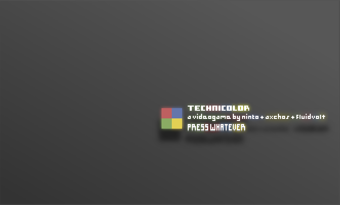
personally i like yellow/gold best, just because of the way it works with the white text
hey guys. a new new update on the project. so psyched.
gizmo- programmer
fluidvolt- musician
someonesomewhere- artist (durhur)
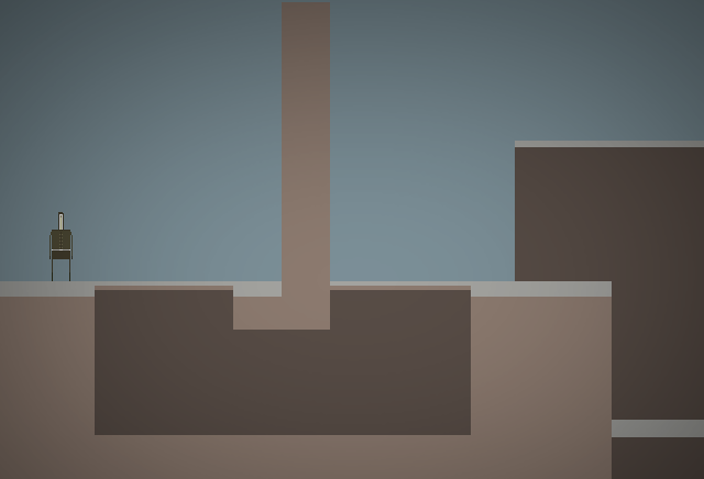
i like the mix of really simple pixel graphics with the hi-res gradient backgrounds, it's kind of funny in a way, but it looks nice
no, I'm confused.
EDIT: gizmo and i had a terrible misunderstanding. :c he thought i meant pc games, and i thought he meant flash games.
so i'm off on a search for another programmer!
Last edited by someonesomewhere (Dec 9, 2010 12:20 am)
are you emthree?
sorry i am confusd
I don't think he is HAHAHAHAHAH
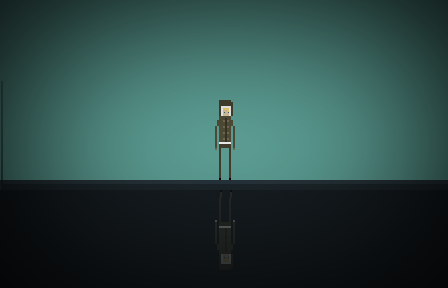
I think the actual level needs some more detail and that the character should be positioned facing the right somewhat, no facing the audience
I haven't added all the clouds, foliage, and such.
Plus, he should be facing towards the audience, because he hasn't even moved yet. The default is facing us.
Last edited by someonesomewhere (Dec 21, 2010 7:00 pm)
Hey guys.
I've drawn more than 50% of the levels on graph paper, and I'm in the process of shifting them into pixels.
Will keep you posted!
Really stinks that we had miscommunication dude. Wish you were still my partner! D;
But yeah, I found a programmer on another site a while ago.
Thanks for your interest! =]
Last edited by someonesomewhere (Feb 9, 2011 8:11 pm)
This is looking good. Do you have a development log on TIG? http://forums.tigsource.com/index.php?board=27.0 Might be a good place to get feedback from even more indie game makers.
I like the style you have going on here. Keep it up!
This looks pretty awesome. I like the yellow start screen the best.
Will you be doing the soundtrack for this yourself? If not I would be glad to contribute.


