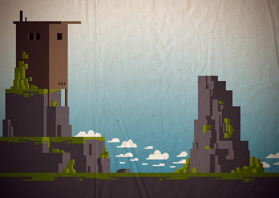
Oh man! I love that! Some of the coolest pixel art I have ever seen! Great job.
Wow, thanks! O: I'll make sure he hears some of this feedback ![]()
if you made the whole game with that kind of texture that would be awesome, ![]() natural textures with digital art.
natural textures with digital art.
I also agree that this looks awesome!
I would like to see how it looks with the texture only applying to the sky, I think it looks a little funny when the wrinkle goes through the foreground. But that's just me! All in all, I think the style is awesome, and I can't wait to see how this develops and I can't wait to play it! Good work!
Not sure how your re-working of the walk cycle animation is coming along, but if you can get it out of the library, there is a lot of good info/advice/insight on walk cycles in "The Animator's Survival Kit" by Richard Williams starting on page 106. Good luck!
-sam
Thanks pixls & xero!
@ sam:
As I said, it's just some experiments. And I sorta agree it looks a bit weird having the wrinkle placed there, but y'know, it's just like the pixel on the paper, not the paper on the pixel. Thanks for the reference to his book, I'll definitely head over to the library and check it out if they have it. Thanks!
The Animator's Survival Kit Is most awesomest book in the universe. Everyone should have a copy!
Definitely get a thread going on tigsource if you haven't already, the feedback other developers and designers could give is really rewarding, that and if you need any hep on anything they're a great community. There are also a lot of articles on design and such which provide some interesting perspectives.
Really interesting so far, glad to see some progress since I last checked up on this. I was accepted onto a game design and development degree today to start in September so I may be of some help in later months.
Yep, I think I'm going to sign up later tonight. Holy crap, nice job on the game design and dev. degree!!!!!!!! Do you have a gallery/website anywhere I can check out? Congrats man!
Edit: write up about the game here: http://forums.tigsource.com/index.php?t … 525688#new
Last edited by someonesomewhere (Mar 10, 2011 12:44 am)
Cheers man, I actually have very little experience with videogame design and development bar some middleware experience and some light programming, I haven't a portfolio or anything, I stopped for a while whilst I studied film and media at a college level because I began to hate videogames, mainstream games usually bore the hell out of me and I needed something new. I play a lot of indie games, mostly indie games in fact, and do little reviews and write ups every now and again, If it wasn't for the indie scene I would never have thought about getting into game design.
I think everyone has picked up a map editor at some point, I used to have a ton of awful CS Source maps I made knocking about. I'm in the process of teaching myself Unity and a few languages, hopefully I'll have something to show for my effort at some point, but I am or was notoriously unproductive. The last 'game' I actually completed to a point was a 6 month collaborative project in RPG Maker with a friend, that was a very long time ago.
Aw man. Yeah, I tend to play more indie games over mainstream too. Not because they bore me, I'm just always more amused with indie games. Oh that's cool!
Yeah, I feel like I take forever too when in the process of game development, and then I always loose interest in the game subject. :C
@someonesomewhere
Read your tigsource write-up, this sounds like a really cool project! I like the cooperative theme a lot. Keep experimenting, it's looking awesome!
If your library doesn't have the book and you want to see it, let me know and i'll e-mail you some scans.
@KeFF
Yeah, that book rules! It has proved to be an invaluable resource time and time again.
-sam
This is looking good, I like the Another-World-y graphics. The paper texture is a nice touch- you could try to add an offset to the foreground texture, so it'd look like two layers of paper. Could be cool together with something like parallax scrolling.
I like the cooperative theme a lot.
I don't understand what you mean? But thanks! ![]()
"The paper texture is a nice touch- you could try to add an offset to the foreground texture, so it'd look like two layers of paper"
That's actually a really sweet concept, passing it along, thanks. ![]()
I like the cooperative theme a lot.
I don't understand what you mean? But thanks! ![]()
"The paper texture is a nice touch- you could try to add an offset to the foreground texture, so it'd look like two layers of paper"
That's actually a really sweet concept, passing it along, thanks. ![]()
